Watch this video to see how you can make the most of your Edurio survey results, or follow the steps below.
In the results section of the platform, find the survey you want to review. Then, click on Results.
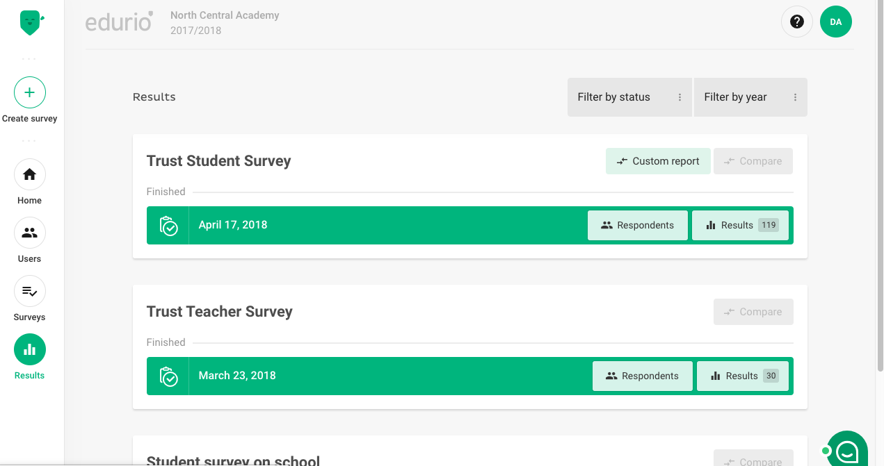
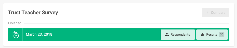
A new tab will open with this survey’s results.
There are two main ways to review a survey’s results:
- Modules and questions
- Matrix view
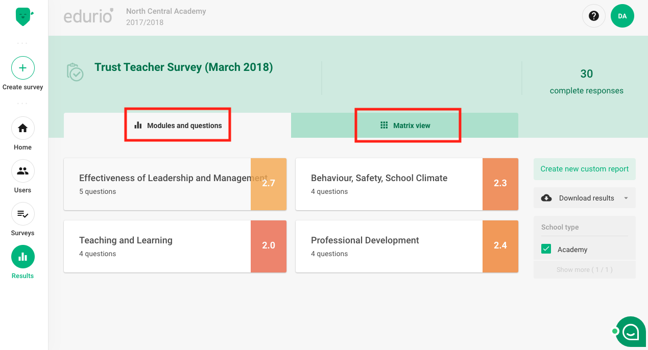
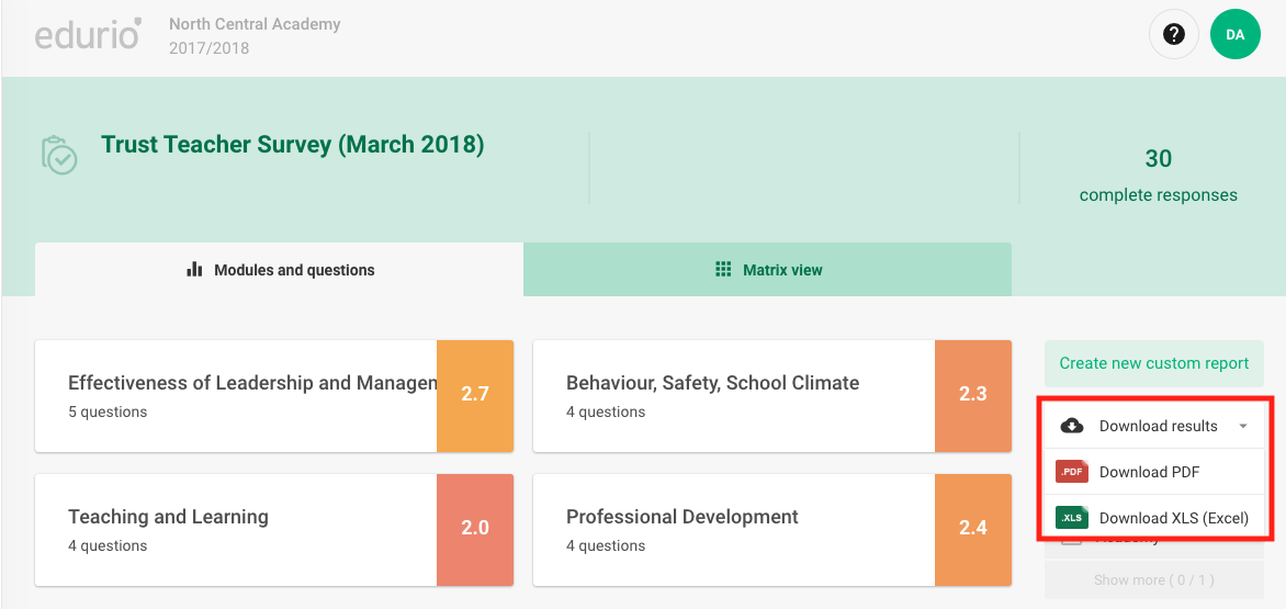
1) Modules and questions
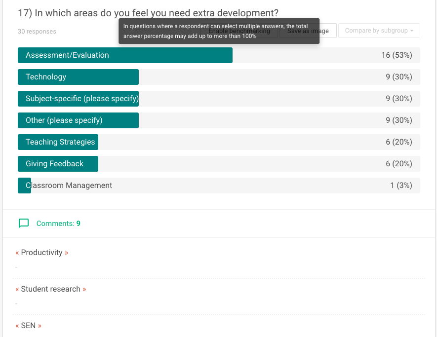
Each Edurio survey is compiled of various modules. Modules are subset themes of a survey and are composed of specific questions that give insights into this theme.
By clicking on a module, you will see the individual question results that are grouped under this module.
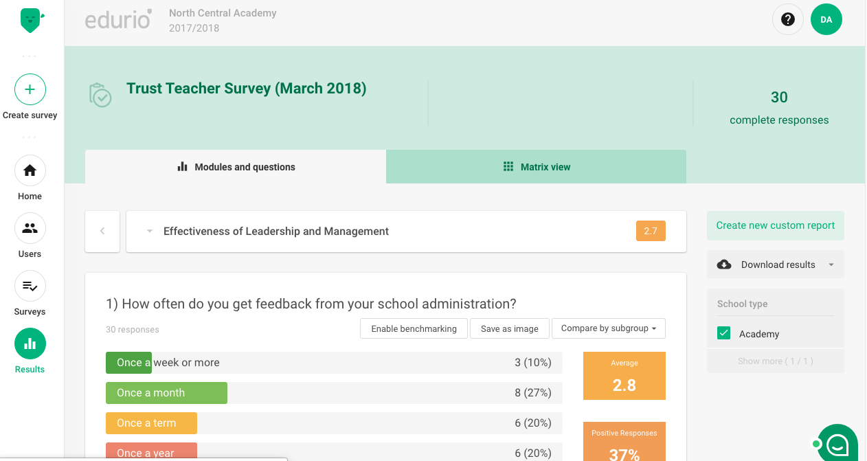
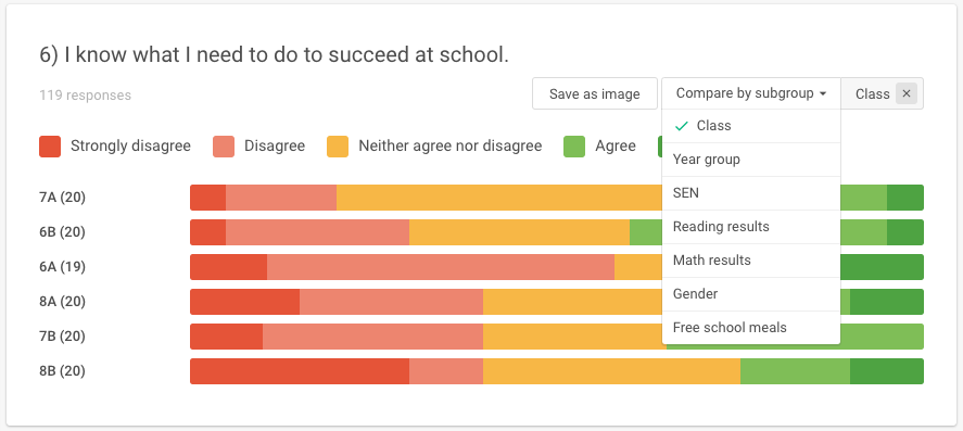
Below each question you will find buttons to Enable benchmarking, Save as Image and Compare by subgroup.
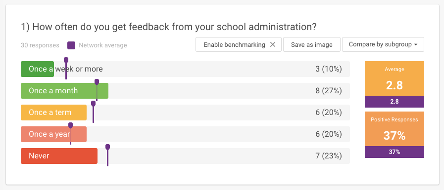
When you click on Enable benchmarking, you will see violet markers that indicate the average results of all the schools that participated in this survey within your larger organization. Use this to see for which questions you are above or below average within your organization.
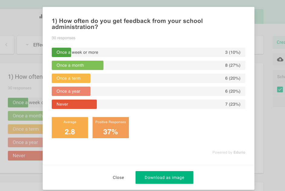
You can save any graphic as an image file, to share with others, show in presentations, or use in other ways.
Compare by subgroup allows you to see how various groups who responded to this question compare. For example, in a student survey you will be able to compare by different student groups or other filters that are activated for this survey.
How are the averages calculated?
In calculating the group and school averages, each possible response is given a value from 1 to N (number of available responses), where 1 is the lowest-ranked answer (e.g. “not at all” or “not useful at all”) and N is the highest-ranked one (e.g. “very often” or “very useful”). The average response is the mean of all the responses to a question (in a selected group or in the school).
What do the colors mean?
Bar graphs and line graphs are shown on a colour scale from red to dark green. The same scale is used with numeric results, where the colour represents the response closest to the result. Graphs that do not represent a scale are shown in purple.
Why are there sometimes differences in respondent count?
For each question we have added the amount of respondents; how many students, parents or teachers have responded to a question. It is not possible to skip a question, but it might be that a respondent has paused their survey and has not responded to all of the questions.
What are positive responses?
The percentage of positive responses is calculated by determining the proportion of the responses that belong to the top half of the possible responses, excluding the middle response when the number of possible responses is odd.
2) Matrix view
The matrix view compiles all your survey results into one overview. Here, you’ll see all of the questions in the survey (going down, vertically), as well as all of the respondent groups that participated in the survey (going across, horizontally).
For a teacher survey there will only be one group:
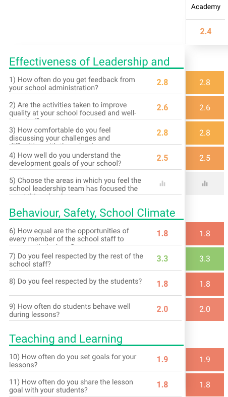
For a student survey, you will see all of the groups that completed the survey.
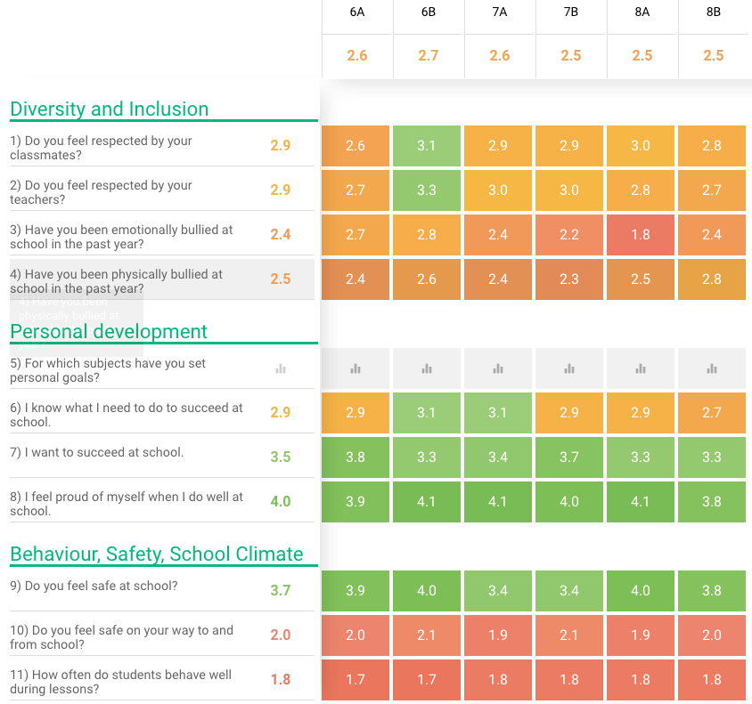
As you review the matrix results, take some time to reflect on the results by reviewing these questions:
- Are there any questions that have higher or lower results across all or most respondent groups?
- A question that has higher results across all or most respondent groups can be looked at as a strength within your school. Think about initiatives and other actions that have been taken that might be related to this question topic.
- A question that has lower results across all or most respondent groups can be looked at as a weakness within your school. Is the question topic something you are aware of as being an issue? Is the question topic something you are actively working on with initiatives and actions?
- Are there any respondent groups that have higher or lower results across all or most questions?
- A group that has higher results across all or most survey questions can be looked at as a strong group in your school. Think about what you know about this respondent group that makes it a strong group. The groups with higher results can be linked with those teachers that can share their examples and methods with others to help them improve.
- A group that has lower results across all or most survey questions can be looked at as a “red flag” group in your school. Think about what you know about this group that makes it stand out. Are you aware of the issues raised in the survey about this group? Are you currently addressing any of the issues raised in the survey with this group through initiatives and actions?
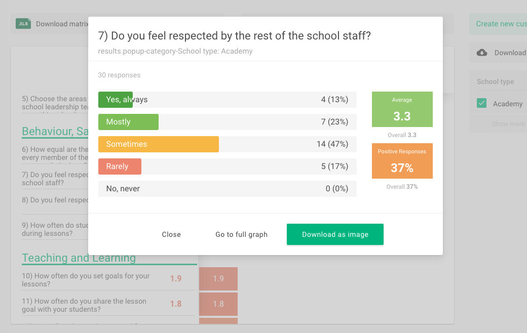
In the matrix view, you can click on individual boxes to see the results more in depth. From there you can choose to a) Close the graphic and go back to the matrix view, b) Go to the full graph and see this specific question and filtered group, or c) Download the graphic as an image for later use.
What should I do with comments and open response questions?
Comments and open response questions are a great way to get a better sense of what respondents were thinking and how they were feeling when they filled out the survey.
Go through the responses in an orderly fashion and take note if any trends form – if multiple respondents write similar comments. This could indicate an underlying topic that would be worth exploring or an underlying cause that may have affected your results.
Download your survey results summary.
On the right side of the screen you will see the option to Download results. Choose PDF for a PDF download of your results summary. Download XLS will allow you to work with raw survey data and to create your own analysis of your survey results.